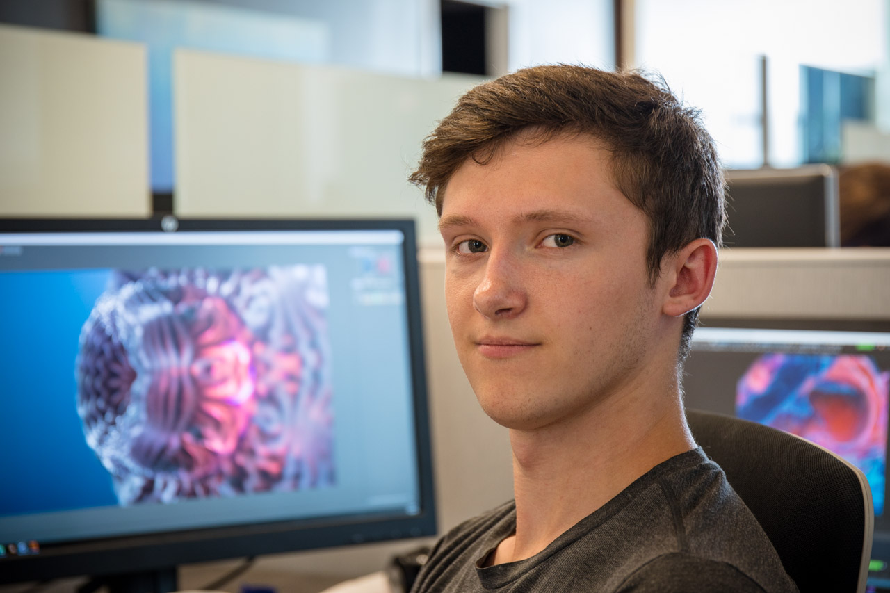
Project Highlight: New FUSE Logo Animation by artist Zak Katara
In this first post of our newest blog series, we’re highlighting FUSE artist Zak Katara and the new FUSE logo animation. You may recognize this animation — it’s prominently displayed on our homepage. Zak worked on this while completing other projects at FUSE, so it took him about three months to finish. It also went through six full versions before landing on the final version below.
This logo animation took inspiration and ideas from every member of the FUSE team. We’re particularly happy to highlight this project because it really showcases our team’s collaborative talents and skills.
About the Artist
When he started this project, Zak had only been with FUSE for four months. Coming from a 2D background, this was Zak’s first major animation project. Before FUSE, his expertise was creating realistic still images.
He also excels at material creation, especially metallic materials and lighting. These skills are at the forefront of this project’s design. Completing this project sparked a newfound interest in animation both here and outside of work.

The Inspiration
Executive Producer Chris asked Zak in a meeting to create a new FUSE logo animation for the demo reel. He didn’t have a specific concept in mind, so he gave Zak complete creative freedom with this project. With this goal in mind, Zak started collecting images for inspiration – and spent a lot of time on this. All in all, he sifted through hundreds of images on Art Station, focusing primarily on those with industrial design elements.
“One thing I always do when I start a project is jump direct into lighting and material work because I want to see something while working on it. That definitely drove this design a lot.”
It was creative director Josh who kickstarted the cyberpunk lighting and color vibe of the final logo animation. Josh had the main idea for the lighting and referred him to the movies Atomic Blonde, Ghost in the Shell, and Blade Runner 2049 for inspiration. “Having the lighting in mind before building it gave me a good workflow,” says Zak.


Animation in Progress
Zak handmade all the materials and textures in Substance Designer (his favorite program) and then did the rest in Cinema4D. He rendered the entire animation using RedShift. Then the post-production work was all done in After Effects.
Rendering the smoke presented a unique challenge. In the end, it needed to be rendered out separately from the main pass. The “main pass” included the metal materials and the majority of what’s going on in the animation. At first, the lighting didn’t quite look right through the smoke, so he needed to make quite a bit of color and light adjustments. But once he got it right, the smoke worked perfectly with the lasers and the resulting FUSE logo.
Collaboration with the FUSE Team
Originally, Zak intended this to be a “cool and mechanical” industrial, abstract animation. He had an interesting concept but needed help connecting everything to FUSE. So, he presented the first version to the FUSE team, and they provided extensive feedback. Then he updated the animation and presented it again. And again.

During each of the six rounds of revisions, the FUSE team came together to offer suggestions and ideas. As a result, every element of the video – from the lasers to the smoke – came from someone in the group during these feedback sessions.
An Unforeseen Challenge
When asked about his biggest challenge, Zak points to the initial rendering time for all 600 frames of the animation. At first, the render times were higher than he wanted. So he set to work making the scene more efficient.
The long rendering time culprit? All that lighting. Since the animation features an entire set made of metal – which doesn’t absorb any light – it was incredibly hard to light. To fix the rendering time issue, he took out about 75% of the lights, carefully adjusting the complex setup without affecting animation quality. Eventually, he was able to reduce the rendering time down to about ten minutes a frame.

New FUSE Logo Animation Complete
After going through multiple rounds of review and receiving tons of feedback, the resulting logo animation was perfect to kickstart FUSE’s new look.
On our redesigned homepage, this animation gives visitors a glimpse at the modeling and rendering capabilities of the FUSE team. The lighting and color scheme carries throughout the website, giving it a cohesive vibe. We’re loving the colors and all the tiny details (triangular windows in the background, unique floor textures) in our new logo animation.

Want to see more? You can check out more of our client work here on the FUSE work page.

